Homework 3: Graph Visualization
NOTE: Part 2 of this homework can be done individually, or as a team of
two. Regardless of whether you work with a partner for part 2, parts 1 & 3
should be done on your own.
Part 1: Familiarize yourself with Graphviz
Let's experiment with
Graphviz, an open source
visualization tool for automatically drawing network-like graphs of
linked nodes. The papers we read for Lecture 3 describe algorithms from
the core technology of Graphviz:
To get started:
-
Download the Graphviz software and explore the
gallery of examples. Learn how to run these examples on your own
machine and view the results.
-
Edit by hand some of the input graph files -- see also
the the DOT
file format documentation. Experiment with different display
options.
-
Using your favorite programming language, write code to generate and
output a range of synthetic input files. Your program should
be parameterized (allow you to modify) the number of nodes, the
density/sparseness of edges, etc. Consider using randomness. Don't
over-design your program. The goal is to allow you to prototype and
quickly experiment with a variety of graphs. You can tweak and add
more to your program as you go.
Alternatively, you could write in C/C++
and
directly compile with the Graphviz codebase.
-
Using your program, create a variety of network connectivities
including: a tree, a clique, a planar graph, a bipartite graph,
disconnected components, etc. The size of your graphs should be
"medium" sized (10-40 nodes?). The size should not be too large --
that is, with a little time and modest drawing skills, a good,
"approximately-optimal" layout could be done by hand.
Try the different options in GraphViz to draw each of these graphs.
Which options work best for different types of graphs? Save 5-10
images with your most successful results for inclusion in your
homework writeup to demonstrate the breadth of graph variety
your experimentation.
Part 2: Graph Drawing Application - RPI Course & Instructor Data
Most/all of the students registered for CSCI 4550 are CSCI
undergraduate majors and thus hopefully very familiar with the degree
requirements for the RPI CSCI major. If you are are not a CSCI
major, or if you are a graduate student who got your CSCI undergraduate
degree at another school, you are encouraged to team up with an RPI
CSCI major for part 2. Everyone is encouraged to work with a
partner for part 2 -- and to work with a different partner
than they worked with for the previous homework. You may work alone for this
assignment.
The RPI
CSCI department undergraduate curriculum committee publishes
course planning templates by semester they entered RPI. For example,
here is the
template for students who
entered in Fall 2022 and will graduate in May 2026.
The university's standardized way for presenting degree requirements
is a grid with 8 semesters and 16 credits = 4 classes per term:
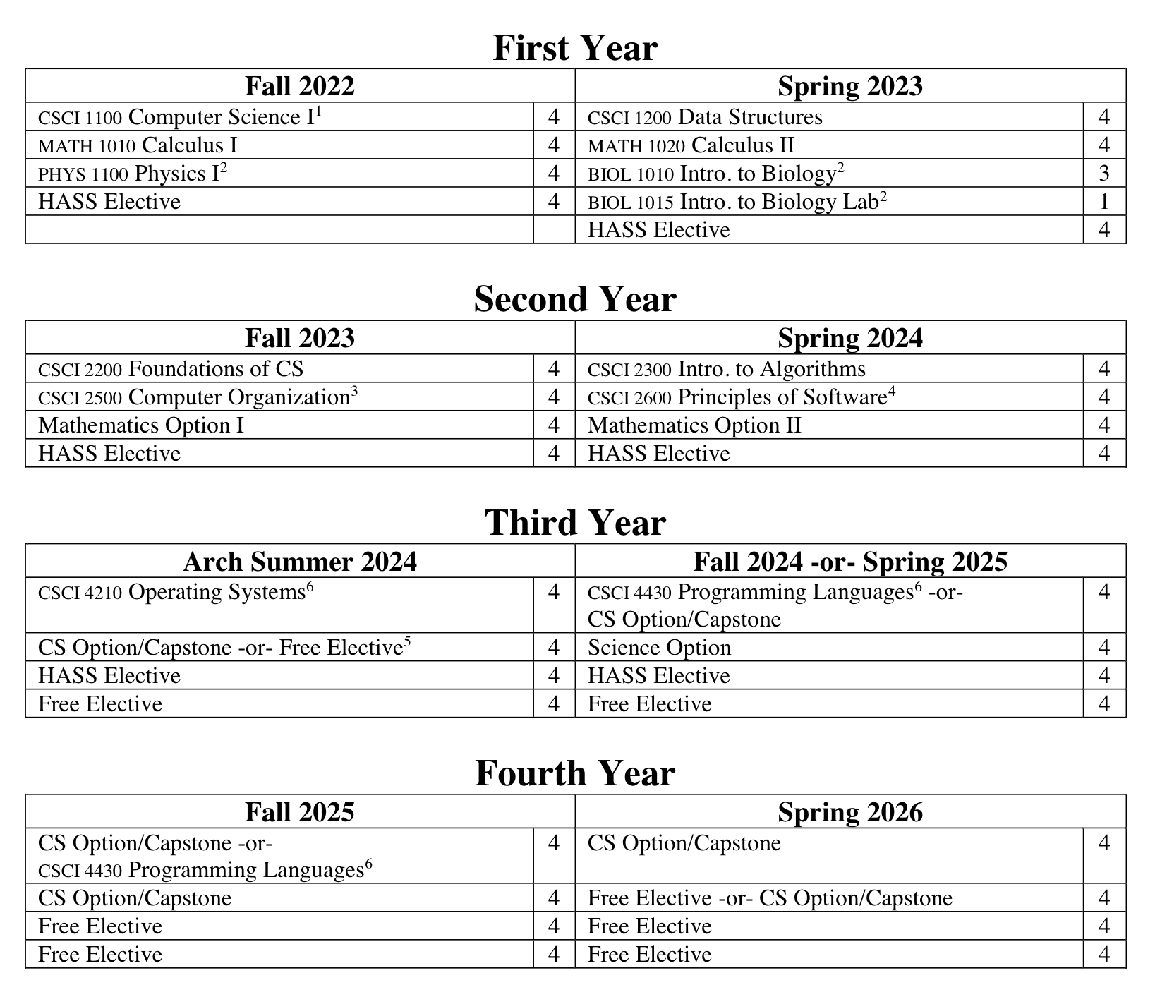
This presentation is straightforward and it provides clear
instructions for the generic student who enters RPI with no prior
credits and follows the template exactly. However, if the student
does have AP credit, or if they are a dual major, or if they end up
dropping a course, or if choose to take a humanaties elective that
conflicts with a required course this chart doesn't spell out what
adjustments are possible.
Here is an alternate visualization prepared
by Prof David
Goldschmidt showing the prerequisites within the required
CSCI-prefix courses typically taken in the first four semesters.
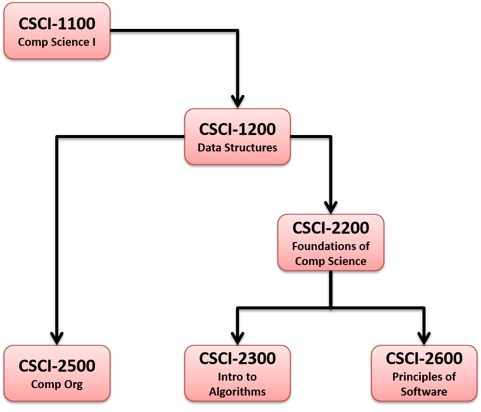
This visualization explains why students should not delay taking
certain courses, e.g. CSCI 2200 FOCS, to prevent a prerequisite
bottleneck that could delay their graduation. However, this visualization only
covers the first two years and only shows the prerequistes within CSCI
courses. Furthermore, it does not include information about what
terms each courses is offered. For example,
CSCI 2600 has not been
offered in the fall semester since 2019.
We will use the dataset collected for
QuACS - the
Questionably Accurate Course Scheduler.
The dataset is available on GitHub:
https://github.com/quacs/quacs-data
and was scraped by RPI CSCI
alum Eli Schiff, and
maintained by the QuACS team.
The data is formatted using the JSON file
format, a popular and relatively simple file structure with
easy-to-use parsers for
Parsers
for Python
and C++
and most modern languages.
Your task is to design a few new and improved graph visualizations and
execute them using Graphviz:
-
A directed graph showing a typical or specific student
progressing through the CSCI degree requirements over ~8 semesters.
You can draw the exact course plan you followed, what
you should have taken (if you had a time machine), or the
course plan you would recommend to a friend who is just starting their
studies at RPI.
Note: You can include the complexity of "the Summer Arch" or ignore it
altogether. You can choose how to handle non CSCI courses: what to
include, what to display, what to omit or simplify.
Carefully consider your audience for this visualization -- students
and their advisors who are making course planning and registration
decisions. Does your visualization help them understand what
modifications are possible? Which classes can be taken early or
delayed? Maybe you can indicate which courses and terms are more
challenging -- workload, time commitment, etc.
-
A bi-partite graph showing two types of nodes: CSCI courses
and CSCI instructors where an edge is drawn between a course and an
instructor if the instructor has taught the course at least once.
There are no edges between instructors, or between courses. This
graph should reveal how faculty and courses cluster by
teaching/research interests and specializations.
The QuACS data is large (it includes data from the last 25 years!).
You should simplify the data to make sure the visualization is
legible. E.g., only include faculty who have taught at least one CSCI
course in the last year, only include CSCI classes that have a minimum
of 20 students, etc.
-
For extra credit you can design and execute an
additional interesting graph of your choice from this data (or subset
of this data).
Experiment with the visual options (layout, color, line style, line
thickness, line shape, text placement, font, etc.). What options are
most successful for the different visualizations? Write an excellent
caption for each of your polished graphs.
Part 3: Discussion
Analyze your experience with the Graphviz tool. Were you
able to successfully execute your designs? Did the tool help you
automatically create interesting, moderately-complex graphs?
Note any weaknesses in the tool or degeneracies with more specific
inputs. Could you have done better by hand? What
adjustments/improvements do you believe are necessary to the graph
drawing engine of this tool?
Write a short review of the tool. How quick was the installation and
learning to use the tool? What resources were most useful? What
sorts of applications/datasets are most appropriate for this tool?
What are the limitations of this tool? What are some
suggestions/cautions to others who consider using this tool?
How to Submit
Regardless of whether you worked with a partner for part 2, each
student should individually prepare their own .pdf report with
embedded images. Be sure to include:
-
~5 graphs of synthetic data demonstrating a variety of graph
types and visualization styling. Write a short caption for each
describing what you were trying to achieve, what was successful,
and/or what needs improvement.
-
Your source code for part 1 that you used to generate synthetic input data.
Note: We won't try to run your code when grading, so
don't include any 3rd party libraries you may have used or the
executable. The code should have some organization and basic
comments, but you do not need to prepare detailed documentation.
-
3 polished graphs of the course data with carefully written captions.
Be sure to point out interesting observations you discovered
about the course and instructor data that the viewer can
see in your visualizations.
-
The name of your partner -- if you worked with a partner for part 2.
-
Your source code for part 2 to process the QuACs data and prepare the input for
your course and instructor graph visualizations.
-
Your review and discussion of the Graphviz tool.
Finally, share your favorite, most-successful image from the assignment on the
Submitty Forum. Make sure your forum post includes a well-written and
descriptive caption to go along with your image.